Find the information that is difficult to distinguish
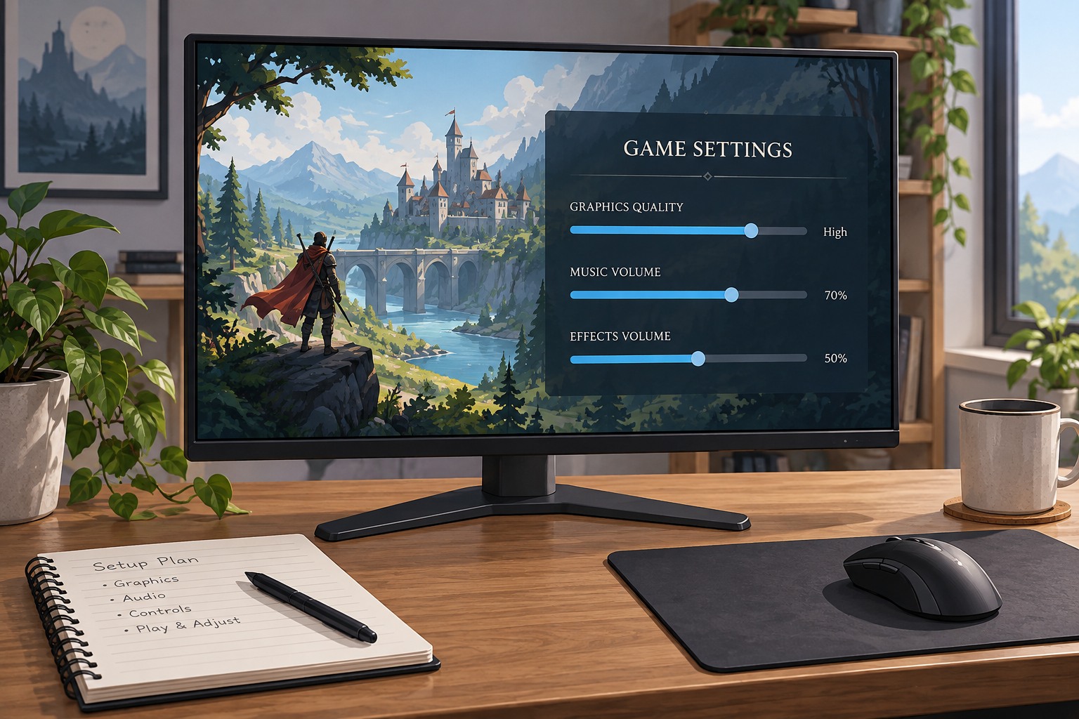
Identify a concrete problem before selecting a preset: two team colors, a quest marker against terrain, a rarity indicator or a warning on the map. A filter applied to the entire scene may affect more than that one cue. Some games instead let you choose colors for specific interface elements, which can offer a more targeted adjustment.
Try the setting in a scene containing the relevant symbols. A menu preview may not show how a marker behaves against different backgrounds or lighting. Check names, shapes, outlines and icons as well as color. Redundant cues can make the information easier to recognize even when two colors remain similar, so look for related options such as marker outlines or label visibility.
Compare presets without assumptions
Preset names describe an intended use, not a guarantee that one is best for every person with a similar visual need. Compare the available options and choose the one that makes the actual task clearer. Adjust strength if the game offers it, and revisit the affected map or interface rather than judging only the appearance of a character or landscape.
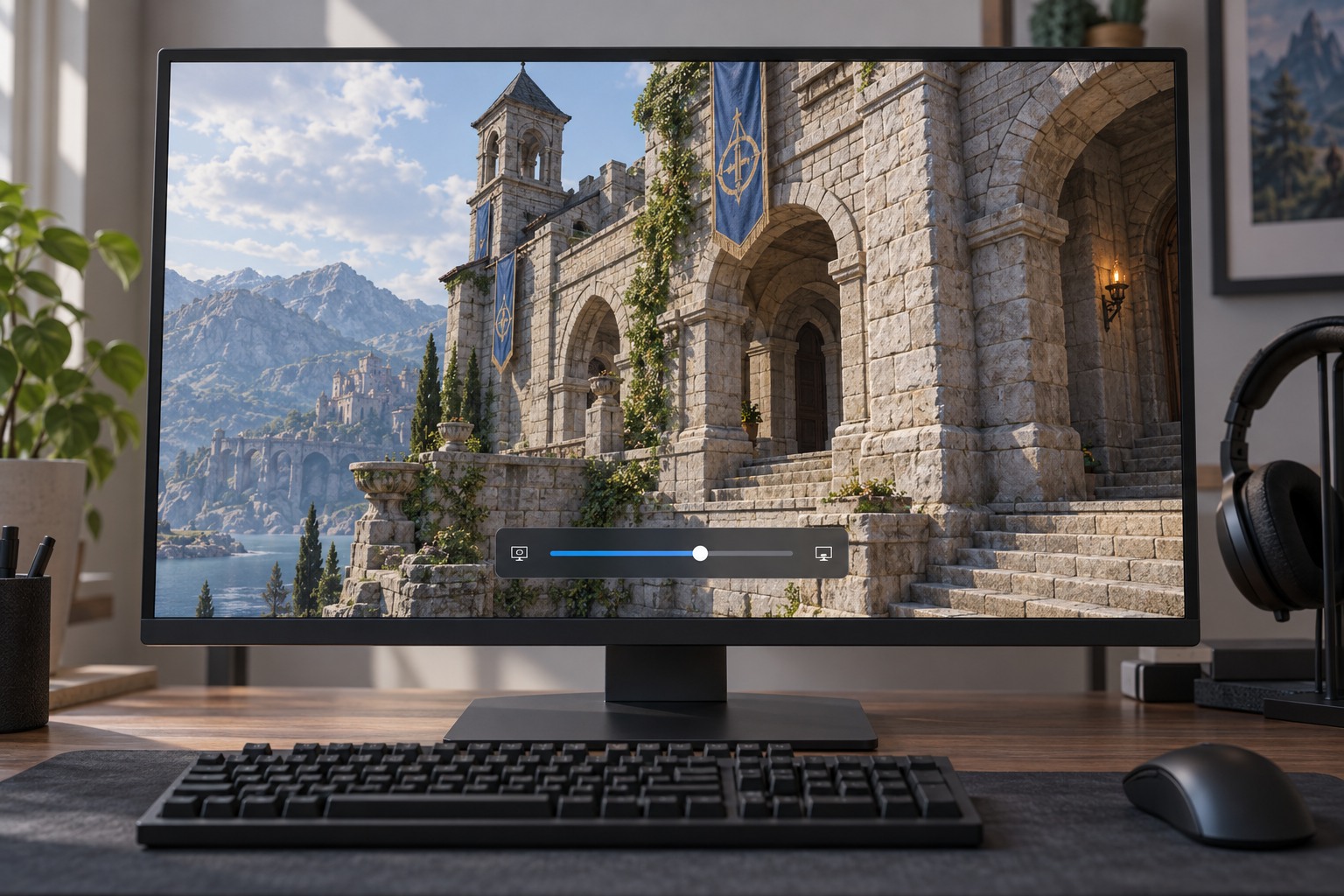
Keep operating-system or display-level filters in mind. If another filter is already active, the combination may produce an unexpected result. Change one layer at a time and record which layer you keep. A game-specific adjustment may leave the desktop unchanged, while a system-wide one can affect screenshots, videos or other applications differently depending on how it is implemented.
Check gameplay and communication
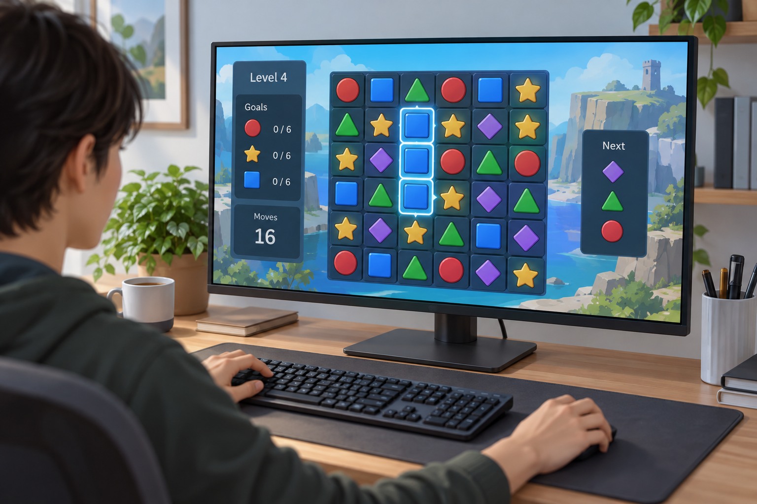
Test whether teammates' verbal descriptions still make sense. If the group calls an objective by its original color but your setting changes it, agree on a location or symbol instead. This is especially useful in cooperative puzzles and games with several similar markers. The goal is shared understanding, not requiring everyone to use the same visual setup.
If the game lacks a helpful option, read its accessibility documentation and consider whether other cues can support the task. Do not assume a filter solves every visual barrier, including small text or low contrast. Keep feedback to the developer specific: describe the two elements that are hard to separate and the situation in which it occurs. That is more actionable than saying the colors are simply wrong.